Apple

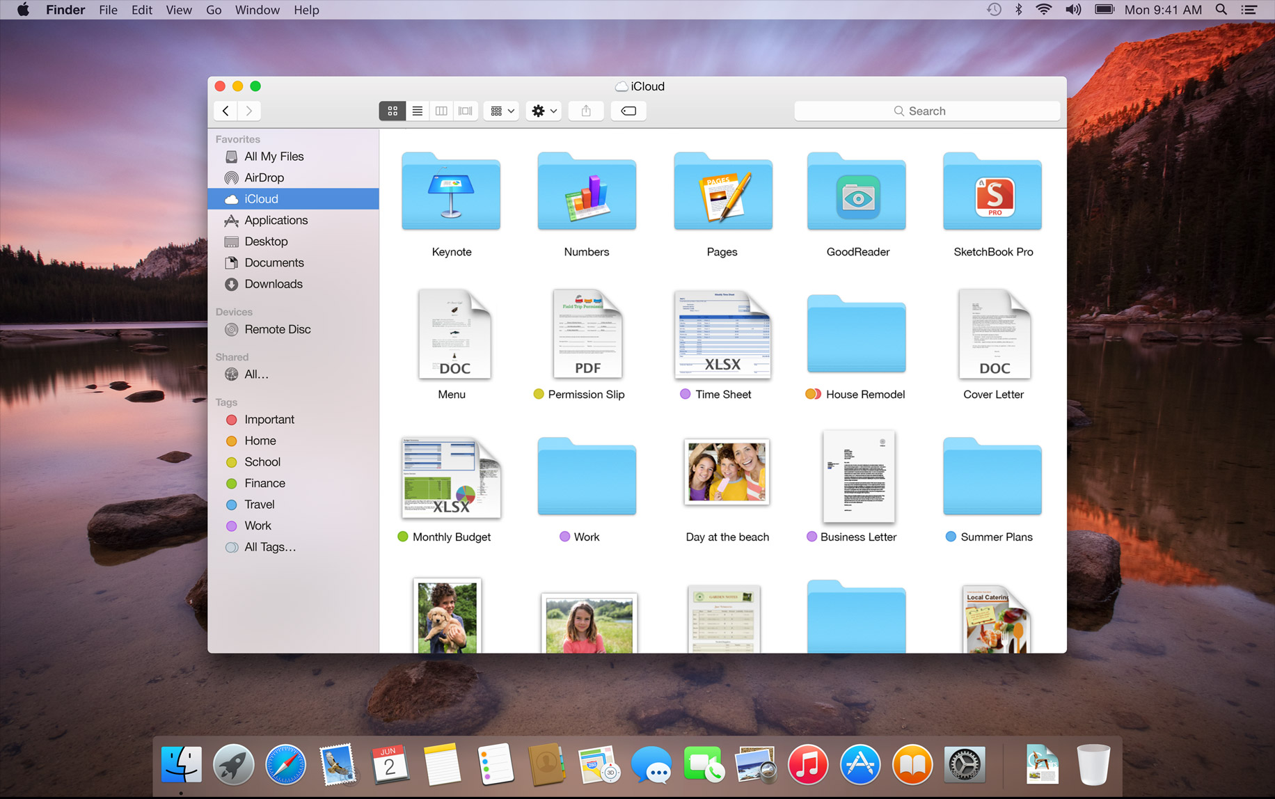
osx 10.10 - Page 1

the 3 small round buttons as well as the scrollbars of the windows looked cheap in 10.7/8/9 already but this? :P

Image

what's up with apple? don't have any decent gfx guys left? :P
It seems to be this mad push towards simplicity at the moment which is (IMO) going too far. Granted earlier versions of Mac OS X and Windows 7 for that matter maybe had a bit too much skeuomorphism going on and were a bit overly flashy in places, but it now seems that they're hell bent on going back to basics to an extreme level.

The launcher now looks like the block we used to have back in 10.4 (Tiger) and the sheer flatness of it is getting silly. The only win there is that there's still a drop shadow on the window. Windows 8 of course has gone even further. No shadows, no shading, no rounded corners, just flat, lifeless squares (and I'm talking about the desktop here). For all the criticism that Metro has had, the Windows 8 desktop is frankly a depressing place to be due to how flat and bland it is. Even Windows 3.1 and IRIX have more rounded/designed GUI elements than that!
Systems in use:
:Fuel: - Lithium : R14000 600MHz CPU, 4GB RAM, V10 Graphics, 36GB 15k HDD & 300GB 10k HDD, New/quiet fans, IRIX 6.5.30
:Indigo2IMP: - Nitrogen : R10000 195MHz CPU, 384MB RAM, SolidIMPACT Graphics, 36GB 15k HDD & 300GB 10k HDD, New/quiet fans, IRIX 6.5.22
Other systems in storage: :O2: x 2, :Indy: x 2
I think it looks bad, but the biggest problem has always been the functionality (or lack of it) of Apple products, not their look.
A number of recent cockups: Removing InterfaceBuilder and loadable .nibs, dropping Objective C, and that abortive garbage collector...
:PI: :O2: :Indigo2IMP: :Indigo2IMP:
Apple's visual design team has been progressively more lost up their own ass ever since they abandoned the Classic look. Feh.
Computers: Amiga 1200, DEC VAXStation 4000/60, DEC MicroPDP-11/73
Synthesizers: Roland JX-10/MT-32/D-10, Oberheim Matrix-6, Yamaha DX7/FB-01, Korg MS-20 Mini, Ensoniq Mirage/SQ-80, Sequential Circuits Prophet-600, Hohner String Performer

"'Legacy code' often differs from its suggested alternative by actually working and scaling." - Bjarne Stroustrup
commodorejohn wrote: Apple's visual design team has been progressively more lost up their own ass ever since they abandoned the Classic look. Feh.

exactly my thoughts. this looks like the kids version of what osx used to be. same goes for websites btw.
where's the creativity these days?
I thought things were reasonable re: UI up through 10.6, tolerable under 10.8.

At this rate, in another year or two my Mac Pro will look like a 3b1/UNIX PC with enormously higher resolution... (Super cheesy video about this total communications processor - mostly text windowing system shown at 7'00" to 8'15")
Then? :IRIS3130: ... Now? :O3x02L: :A3504L: - :A3502L: :1600SW: +MLA :Fuel: :Octane2: :Octane: :Indigo2IMP: ... Other: DEC :BA213: :BA123: Sun , DG AViiON , NeXT :Cube:
I consider OS X 10.6.8 to be the "reference release" of OS X. Everything after that seems to have valued form over function. Too bad it looks like we've seen our last 10.6 security update. It's nice to see a little bit of color get reintroduced to Finder icons in Yosemite, though. I never liked the "let's make everything gray/invisible" approach that has been in place since 10.5.
ehhhh... seems to be what's in fashion now. Doesn't affect anything and you can always still change the skins if it bothers you.

My big beef is that all of the new features look great and useful (same with mavericks+lions) but the system as a whole is just too buggy (at least it seems to be) compared to 10.6... I spend about 90% of my time in 10.6.8 and only rarely boot to 10.9. One of my biggest beefs with the new flavours is, SMB doesn't work with my xbox.

I would like to use the latest and greatest (and sure, I'll admit, I like the way it looks in it's own right, but I still like the way 10.5/10.6 software look "matches" the hardware even more). The new features like the cloudy stuff and iphone integration (sms in messages, answer a call on mac, etc) are nice but it seems apple can't quite get the stability back that they used to have. The annual release cycle put a damper on it. I really wish they would just put that icloud stuff in an extension rather than the system itself.

If a 3rd party app re-introduced most of the icloud features to snow leopard, more people would still be using snow leopard.

ios is apple's focus now... I'll bet in a few years, mac will be nothing more than the dev platform for it. All good things must come to an end and OSX is no different :cry:

But there'll be a clamshell iOS laptop with keyboard and A-series processor to make up for it. Just my opinion.
Thinkpad x220 Slack + DWM

Google: Don't Be Evil. Apple: Don't Be Greedy. Microsoft: Don't Be Stupid.
josehill wrote: I consider OS X 10.6.8 to be the "reference release" of OS X

absolutely, and even there some silly changes have been put in place already (nfs shares menu for example)
C'mon guys - we all knew this was coming. Or at least anyone with an iPhone/iPad that went through what they did with iOS 7.

I'm not saying I like it, but none of it surprises me either.
:Onyx2: :Fuel: :Indigo2: :Indigo2IMP: :O3x0:
looks like a case of acquired taste. anything upwards of 10.5 looks somewhat 'better' to me but overall i don't mind.

what i'd however really like to see -
dark UI colors - in fact: customizable colors for all UI elements.
finder with two-column display and a path-input bar (breadcrumbs a la windows)
oh and tabs - but they might have them already, judging by some pictures on the 'net.
GIJoe wrote: what i'd however really like to see -
dark UI colors - in fact: customizable colors for all UI elements.

I remember how easy that was back in the pre-OS X days!

GIJoe wrote: finder with two-column display and a path-input bar (breadcrumbs a la windows)

Somebody suggested Path Finder to me a few days ago. I haven't tried it yet, but it looks interesting.
GIJoe wrote: finder with two-column display and a path-input bar (breadcrumbs a la windows)
oh and tabs - but they might have them already, judging by some pictures on the 'net.

forklift. best file manager you can get for osx. has tabs, too :P
josehill wrote: I consider OS X 10.6.8 to be the "reference release" of OS X. Everything after that seems to have valued form over function. Too bad it looks like we've seen our last 10.6 security update. It's nice to see a little bit of color get reintroduced to Finder icons in Yosemite, though. I never liked the "let's make everything gray/invisible" approach that has been in place since 10.5.


Tiger forever.

(I'm typing this in 10.4.11.)
smit happens.

:Fuel: bigred , 900MHz R16K, 4GB RAM, V12 DCD, 6.5.30
:Indy: indy , 150MHz R4400SC, 256MB RAM, XL24, 6.5.10
:Indigo2IMP: purplehaze , R10000, Solid IMPACT
probably posted from Image bruce , Quad 2.5GHz PowerPC 970MP, 16GB RAM, Mac OS X 10.4.11
plus IBM POWER6 p520 * Apple Network Server 500 * HP C8000 * BeBox * Solbourne S3000 * Commodore 128 * many more...
Yes, indeed. I'll go with Tiger as the "reference release" for the PowerPC architecture, even though I actually run Leopard on my G4 laptop (17"!).

ClassicHasClass wrote:
josehill wrote: I consider OS X 10.6.8 to be the "reference release" of OS X. Everything after that seems to have valued form over function. Too bad it looks like we've seen our last 10.6 security update. It's nice to see a little bit of color get reintroduced to Finder icons in Yosemite, though. I never liked the "let's make everything gray/invisible" approach that has been in place since 10.5.

Tiger forever.

(I'm typing this in 10.4.11.)
Yeah, my Mac Mini media centre machine (PowerPC) runs Leopard as well, although it did have Tiger on it when I first got it.
Systems in use:
:Fuel: - Lithium : R14000 600MHz CPU, 4GB RAM, V10 Graphics, 36GB 15k HDD & 300GB 10k HDD, New/quiet fans, IRIX 6.5.30
:Indigo2IMP: - Nitrogen : R10000 195MHz CPU, 384MB RAM, SolidIMPACT Graphics, 36GB 15k HDD & 300GB 10k HDD, New/quiet fans, IRIX 6.5.22
Other systems in storage: :O2: x 2, :Indy: x 2
Old foggies don't like change and are scared by it... News at 11. :P
"Was it a dream where you see yourself standing in sort of sun-god robes on a
pyramid with thousand naked women screaming and throwing little pickles at you?"
R-ten-K wrote: Old foggies don't like change and are scared by it... News at 11. :P

Pretentious snots think they're being hip by dismissing any dissenting opinion with "well, you're just afraid of change , granddad!" - film at 11.
Computers: Amiga 1200, DEC VAXStation 4000/60, DEC MicroPDP-11/73
Synthesizers: Roland JX-10/MT-32/D-10, Oberheim Matrix-6, Yamaha DX7/FB-01, Korg MS-20 Mini, Ensoniq Mirage/SQ-80, Sequential Circuits Prophet-600, Hohner String Performer

"'Legacy code' often differs from its suggested alternative by actually working and scaling." - Bjarne Stroustrup
commodorejohn wrote:
R-ten-K wrote: Old foggies don't like change and are scared by it... News at 11. :P

Pretentious snots think they're being hip by dismissing any dissenting opinion with "well, you're just afraid of change , granddad!" - film at 11.

:lol:
R-ten-K wrote: Old foggies don't like change and are scared by it... News at 11. :P


But but this whole website is dedicated to glorifying old stuff , I would expect nothing less ;)
Thinkpad x220 Slack + DWM

Google: Don't Be Evil. Apple: Don't Be Greedy. Microsoft: Don't Be Stupid.