Miscellaneous Operating Systems/Hardware

Classic Terminal Colors

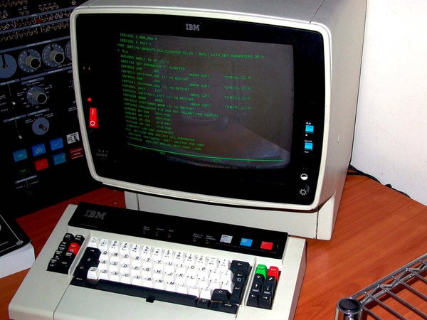
Years ago, I read that the green screen phosphor terminals were actually better on peoples' eyes than modern PCs, due to the color of green causing less eye strain. That perked my interest, and I began being more interested in issues related to terminal colors and eye strain, and also figuring out color schemes emulating classic terminals. What I have here are a few settings that I've developed through basic experimentation that are generally very close to original terminal colors.

Code:
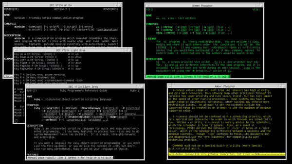
DEC VT100 light gray:     #dddddd
DEC VT100 light blue:     #99ddff
DEC VT100 white:          #ffffff
Green phosphor terminal:  #33ff66
Amber phosphor terminal:  #ffff33

I'll explain each one of these:

  • DEC VT100 light gray: This is a basic light gray color that is closer to the actual light gray used by terminals, than the gray-on-black settings for many terminal emulators.
  • DEC VT100 light blue: In many pictures and videos, the VT100 screens actually show a light blue tint that is very common. This is light gray with that blue tint.
  • DEC VT100 white: Due to backlighting, VT100 characters could look almost white. Since that's the case, a basic white may be preferable in some cases.
  • Green phosphor terminal: This is very easy on the eyes and close to the old green screens. This is the setting that I use every day.
  • Amber phosphor terminal: This is the amber variant, not quite as easy on the eyes, but some people may prefer this style.

Of course, invocation is as simple as...

Code:
uxterm -bg black -fg '#33ff66' &

If you hate ANSI colors in your terminals (they are ugly and make everything unreadable!), then you can mostly turn them off with a few lines of shell:

Code:
TERM=vt220 && export TERM
alias ls 2>/dev/null && unalias ls

For anyone who thinks it's pointless or silly, if you use a computer often, you should pay attention to readability and eye strain. I've found that the green setting is very comfortable and easier on my eyes than other schemes. As for the colors themselves, they are closer to the "real deal" than the presets that come with terminal emulators like Gnome Terminal or Konsole. Those programs have very naive presets that don't actually match the historical colors. For example, gray-on-black does not match the light gray color of a classic terminal. Similarly, green-on-black is often simply any old green, without any thought or effort put into whether this green-on-black scheme even looks similar to an old terminal that it is presumably trying to emulate.

Attachment:
File comment: Terminal colors
terminal_colors.png
terminal_colors.png [ 52.55 KiB | Viewed 688 times ]

_________________
Debian GNU/Linux on a ThinkPad, running a simple setup with Fvwm.
A real 3278 is a dream to code from. The visibility is tops and so is the keyboard.

One time I saw somebody writing COBOL in an emulator with colors set on and I almost needed to heave. I don't understand how people can tolerate the visual noise level but I guess the new generation is used to colors and flashing lights etc. When I code in x3270 it is alway set to work as much as possible in green screen mode. It's a nice emulator and works very well.

_________________
Paint It Blue
bluecode wrote:
A real 3278 is a dream to code from. The visibility is tops and so is the keyboard.

One time I saw somebody writing COBOL in an emulator with colors set on and I almost needed to heave. I don't understand how people can tolerate the visual noise level but I guess the new generation is used to colors and flashing lights etc. When I code in x3270 it is alway set to work as much as possible in green screen mode. It's a nice emulator and works very well.


Colour coding makes life easier by making trivial coding errors (forgot a ", forgot a }) immediately visible. It just saves time.

I have to say I like the greenscreen view, though :)

_________________
while (!asleep()) sheep++;
FWIW, I prefer a light background and a dark text.

_________________
Torfinn
Alver wrote:
Colour coding makes life easier by making trivial coding errors (forgot a ", forgot a }) immediately visible. It just saves time.


Depends on what you're coding what editor what language, etc. In the case I'm talking about there is no smart editor and the coloring just hurts your eyes. The guy just couldn't live without garish colors whether they helped or not I guess because his previous 2 months on the job were using Netbeans and Java. I don't think anybody needs COBOL colorized.

I'm not opposed to Emacs style colorization of source on a white background and I agree it is helpful. I like the autoindent more than the coloring. I still get a thrill when I don't have to set tabs or space stuff out manually. A lot of people call me old fashioned. And I also don't use spellcheckers. Go firgue! ;-)
(yeah, on purpose)

_________________
Paint It Blue
Alver wrote:
Colour coding makes life easier by making trivial coding errors (forgot a ", forgot a }) immediately visible. It just saves time.

This is a highly subjective matter which also depends a lot upon the quality of your eyesight.

I am confused by colours in my editor. On the other hand, to help notice missing punctuation quickly, I like using highlighting for matching (or non-matching) delimiters. This catches the eye attention, without confusing the brain with all these random colours.

If you are using vim (preferrably an old version from before it became as bloated as emacs), putting
Code:
set t_Co=0

in your .vimrc (telling vim that your terminal has no colours, but not disabling blink, underline, highlight, mother-in-law-repellent and other "minor" terminal attributes) is all it takes to achieve this.

_________________
:Indigo: R4000 :Indigo2: R4400 :Indigo2IMP: R4400 :Indigo2: R8000 :Indigo2IMP: R10000 :Indy: R4000PC :Indy: R4000SC :Indy: R5000SC :O2: R5000 :O2: RM7000 :Octane: 2xR10000 :Octane: R12000 :O200: - :O200: 2x2xR10000 :Fuel: R16000 :A350:
among more than 150 machines : Apollo, Be, Data General, Digital, HP, IBM, MIPS before SGI , Motorola, NeXT, SGI, Solbourne, Sun...
miod wrote:
This is a highly subjective matter ...

Period, full-stop. :mrgreen:

_________________
Then? :IRIS3130: ... Now? :O3x02L: :A3504L: - :A3502L: :1600SW: +MLA :Fuel: :Octane2: :Octane: :Indigo2IMP: ... Other: DEC :BA213: :BA123: Sun , DG AViiON , NeXT :Cube:
It's true that some things are subjective, but there are certain matters related to readability that must have some objectivity. Some color schemes can cause eye strain, and certain color combinations can have poor visibility.

For example, some "ls" listings may use navy blue on black, which is terribly unreadable. However, another entry shown in yellow on black does not have the same problem. Studies on eye strain have also shown that green is the most soothing color for the eyes.

_________________
Debian GNU/Linux on a ThinkPad, running a simple setup with Fvwm.
bluecode wrote:
A real 3278 is a dream to code from. The visibility is tops and so is the keyboard.

One time I saw somebody writing COBOL in an emulator with colors set on and I almost needed to heave. I don't understand how people can tolerate the visual noise level but I guess the new generation is used to colors and flashing lights etc. When I code in x3270 it is alway set to work as much as possible in green screen mode. It's a nice emulator and works very well.

It looks very well made... You could probably bludgeon someone pretty easily with a keyboard like that. Nice green screen to boot. :)

Attachment:
ibm-3278.jpeg
ibm-3278.jpeg [ 226.68 KiB | Viewed 297 times ]

_________________
Debian GNU/Linux on a ThinkPad, running a simple setup with Fvwm.
Nice pic! That is actually the keyboard for the operator's console not the one coders use but I believe it's the same housing. Steel, and heavy! When men were men and nobody knew what aluminum was...

_________________
Paint It Blue